How to Sell More on Shopify: A 2026 Conversion Playbook
Most advice on how to sell more on Shopify starts with traffic. That's backwards. The bigger opportunity is usually the gap between what average stores convert and what strong operators convert from the same demand.
Benchmark summaries for 2026 put global ecommerce conversion at about 1.4%, while Shopify-store benchmarks commonly sit around 1.4% to 2.2%, with top performers reaching 3.2% to 4.7% according to Shopify conversion rate benchmarks. That gap is the whole game. If most sessions don't convert, and your paid traffic is already expensive, the fastest path to more revenue is to monetize the traffic and intent you already paid for.
The mistake I see most often is simple. Merchants obsess over landing pages and ad creative, then stop caring the second the order is placed. That leaves money on the table twice. First at checkout, then again in the post-purchase window where customers are still paying attention, still trusting you, and often still willing to buy one more thing.
The Conversion Gap Most Shopify Stores Leave on the Table
Strong Shopify operators win by getting more revenue from the traffic they already paid for. The gap shows up before checkout, during checkout, and after the order is placed.
Independent benchmark data puts the average Shopify conversion rate at about 2.2%, with top 20% stores at 3.2%+ and top 10% at 4.7%+ based on Shopify checkout conversion benchmarks. That spread is large enough to decide whether paid traffic scales profitably or stalls.
Teams focus on the part of the funnel that looks easiest to present in a weekly meeting. New campaigns. New creatives. New landing pages. The better stores still work those channels, but they also treat the post-purchase window as a live revenue surface, not a receipt page.
Revenue leaks happen in three places
Revenue usually slips in the same order:
- Product detail page drop-off: the shopper does not get to confidence fast enough.
- Checkout abandonment: buying intent is there, but mobile friction, hidden costs, or weak payment options kill completion.
- Post-purchase dead space: the order goes through, then the store shows a confirmation page, a shipping note, and nothing else.
That third leak matters more than most operators admit. Top-quartile stores already know the customer has converted, trust is highest, and card details are still active. They use that moment to drive order edits, one-click thank-you-page offers, and retention triggers that increase first-order value and improve the chance of a second purchase.
| Funnel Stage | Median Store | Top-Quartile Store | Typical Lift Source |
|---|---|---|---|
| Product page to cart | Generic merchandising | Clear offer and fewer objections | Better hero, variant handling, trust placement |
| Checkout | More friction and hidden surprises | Cleaner mobile completion path | Field removal, express pay, early cost visibility |
| Post-purchase | Thank-you page ignored | Intent monetized after purchase | Order editing, upsells, retention triggers |
Here is the practical rule. If traffic is already expensive and conversion intent already exists, fixing post-click friction and post-purchase monetization usually produces revenue faster than launching another acquisition test.
Category context still matters. Home and furniture stores often convert differently from beauty, supplements, or jewelry, and broad averages can hide that. Strong operators benchmark by device, category, and traffic source first. Then they test one lever at a time and hold every change to a revenue metric: add-to-cart rate, checkout completion, average order value, and repeat purchase rate.
Pre-Click Merchandising That Lifts Add-to-Cart
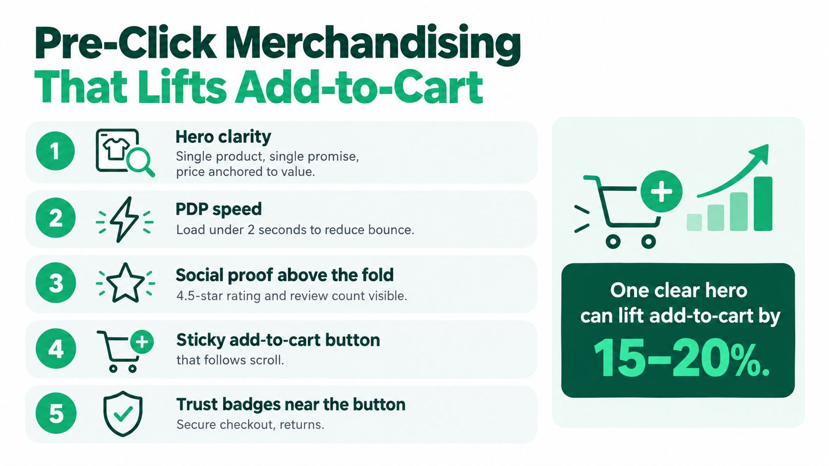
Before you touch checkout, fix the product pages that send weak buyers into it. Add-to-cart rate is where a lot of stores underperform because the merchandising is indecisive.
The best product pages do five things above the fold. They show one product, make one promise, anchor the price to value, reduce variant confusion, and answer the first objection before the shopper has to scroll.
The four PDP problems that depress add-to-cart
I keep seeing the same failures:
- Buried call to action: the add-to-cart button sits below oversized lifestyle blocks or too many accordions.
- Vague imagery: the shopper still can't tell what arrives in the box.
- Cost surprise: shipping, taxes, or delivery timing show up too late.
- Weak objection handling: no returns reassurance, no proof, no fit guidance, no usage clarity.
If you want a solid outside perspective on category structure and presentation, this guide on merchandising help for consumer brands is worth reviewing alongside your own PDP audit.
Run this audit on your top three SKUs today
Score each product page against this checklist:
- Hero clarity: one headline, one benefit, one obvious product.
- Price anchoring: explain what the price includes or why the bundle is worth it.
- Mobile thumb reach: make sure variant selectors and add-to-cart controls are easy to hit on a phone.
- Sticky add-to-cart: keep a persistent purchase option visible during scroll.
- Proof near the button: reviews, ratings, or customer evidence should sit close to action.
- Transit expectations: surface shipping speed or dispatch timing before cart.
- Urgency honesty: only use low-stock or time-based prompts when they're real.
- Image utility: show product angle, scale, texture, and in-use context.
- Variant clarity: avoid dropdown ambiguity when swatches or labels can do the job better.
A lot of “conversion optimization” is just better merchandising with less clutter.
If your team needs a practical reference for structuring these pages, use this walkthrough on Shopify product page optimization and compare it against your current template, not your ideal one.
Checkout Friction by Device and How to Remove It
Cart abandonment is still the biggest revenue leak in ecommerce. Benchmark summaries put average cart abandonment at 70.22% globally, with mobile abandonment around 80.02% versus 66.41% on desktop, and unexpected extra costs cited by 48% as a leading driver in ecommerce cart abandonment statistics. If you only fix one operational surface this quarter, fix mobile checkout.
Checkout review still happens on a desktop monitor and gets called done. That misses the point. The friction isn't theoretical. It sits in field order, keyboard switching, autofill breaks, and hidden cost disclosure.
Cut fields before you redesign anything
Start with subtraction.
| Field | Desktop Keep? | Mobile Keep? | Reason |
|---|---|---|---|
| Company name | Usually no | No | Most DTC orders don't need it |
| Address line 2 | Optional | Optional | Keep available, not required |
| Order notes | Optional | Usually no | Adds clutter for most stores |
| Marketing opt-in pre-ticked | No | No | Adds distrust and distracts |
| Forced account creation | No | No | Slows purchase and kills intent |
The rule is simple. If a field doesn't help payment authorization, delivery, or compliance, challenge it.
Mobile-first fixes that ship fast
Here's the sequence I'd use in one sprint:
- Turn on accelerated checkout options like Shop Pay, Apple Pay, and Google Pay.
- Match field order to native autofill behavior so the phone does more work than the customer.
- Remove non-essential fields starting with company name and note fields.
- Show shipping and tax expectations earlier so the customer doesn't hit a surprise wall.
- Review every tap path on an actual phone across iPhone and Android.
If you want a practical companion resource, this article on how to reduce cart abandonment is useful because it focuses on the friction points merchants often leave unresolved.
For address entry specifically, use a setup that supports accurate autocomplete and sane field ordering. This guide on Shopify address autofill is a good reference when you're cleaning up mobile input flow.
Don't start by redesigning checkout. Start by deleting friction.
Choosing the Right Upsell Surface for Your Store
Most upsell setups fail because merchants stack offers everywhere instead of matching the surface to the store stage.
A low-trust store with inconsistent product-market fit shouldn't throw aggressive post-purchase offers at every buyer. A mature catalog with strong repeat behavior shouldn't rely only on cart cross-sells. The right surface depends on how much trust you've already earned and how much complexity your ops team can absorb.
Pick the surface that fits the stage
| Store Stage | Best Surface | Offer Range | Primary Metric | Watch Out For |
|---|---|---|---|---|
| Early-stage catalog | Cart drawer | Lower-friction add-ons | Add-to-cart value | Overcrowding the cart experience |
| Proven hero product | Post-checkout one-click offer | Logical companion product | Incremental revenue per order | Irrelevant add-ons |
| Content-rich brand | Thank-you page upsell | Complementary education-led offer | Offer take rate | Pushing too hard after purchase |
| Mature post-purchase operation | Order status page | Ongoing add-ons and reorders | Repeat order value | Fulfillment complexity |
My opinionated take
For newer stores, the cart drawer usually wins because the customer is still deciding and needs help composing the order.
For mid-market operators with a proven hero SKU, post-checkout one-click offers are often stronger because they monetize confirmed intent without risking the initial conversion.
For mature brands, the order status page is underused. Customers come back there on purpose. That's not passive traffic. That's engaged attention. Use it.
Turning the Post-Purchase Window Into Revenue
This is the surface most brands underbuild.
The order is placed, support gets busier, and the storefront goes quiet. That's a waste. The period right after purchase is where intent is freshest, address mistakes can still be fixed, and a relevant add-on feels helpful instead of intrusive.
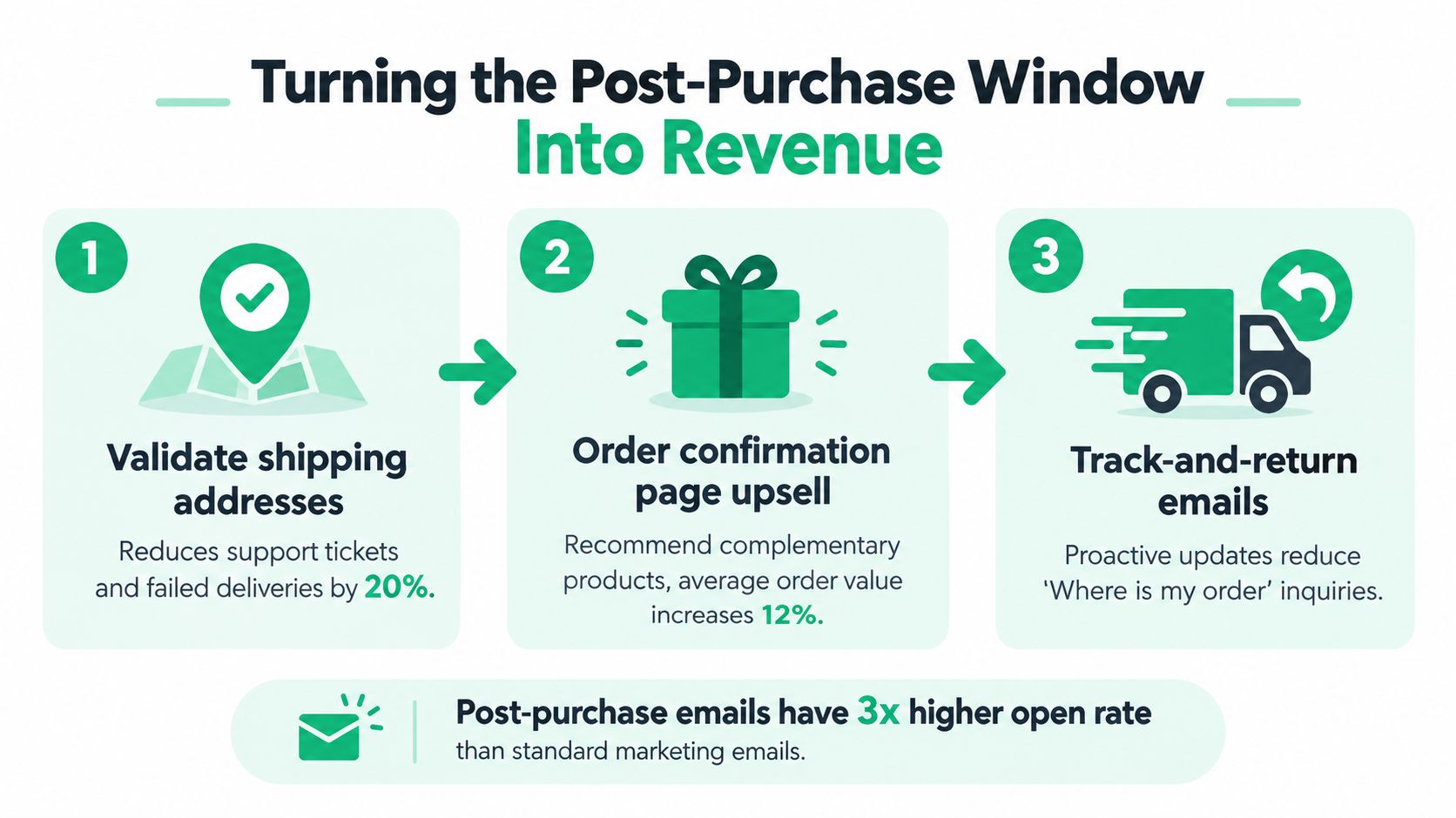
Build in this order
I'd sequence post-purchase improvements like this:
- Address validation first: it prevents bad data from becoming support debt.
- Order editing second: it lets customers fix mistakes or add forgotten items without canceling.
- Upsells third: once the operational layer is stable, monetize the window.
This order matters. A sloppy post-purchase flow creates tickets. A clean one reduces them while opening a new revenue surface.
What the flow looks like in practice
A customer buys a premium kitchen item, then realizes they forgot the accessory that makes it usable on day one. If your only option is “contact support,” you've created cost and delay. If your order confirmation or status experience lets them add that item directly, you've captured existing intent instead of forcing a second shopping session.
That's why I like tools that combine operational control with monetization. For example, SelfServe lets merchants support customer order changes within defined rules, validate addresses, and place upsells on Thank You and Order Status pages. That combination matters because post-purchase revenue works best when support and merchandising are wired together, not handled in separate systems.
This video gives a useful visual of how post-purchase monetization can work inside the customer journey:
Protect buyer momentum
One thing operators often miss is payment continuity. If a customer checked out with a wallet, any follow-up purchase flow should preserve that convenience as much as possible. The more you force re-entry, the more intent you lose.
If you're planning this layer, review examples of post-purchase monetization on Shopify and compare them against your current Thank You and Order Status experience. Most stores don't have a monetization strategy there at all. They have a receipt page.
The Thank You page isn't the end of the funnel. It's the first page after trust is proven.
Retention Loops That Compound After the First Order
Retention is where post-purchase work turns into margin.
Many brands treat retention like a calendar exercise, sending the same scheduled messages whether the customer bought once, added an upsell, skipped a refill, or tried to cancel. That leaves money on the table. The better system reacts to behavior and pushes each customer toward the next logical purchase.
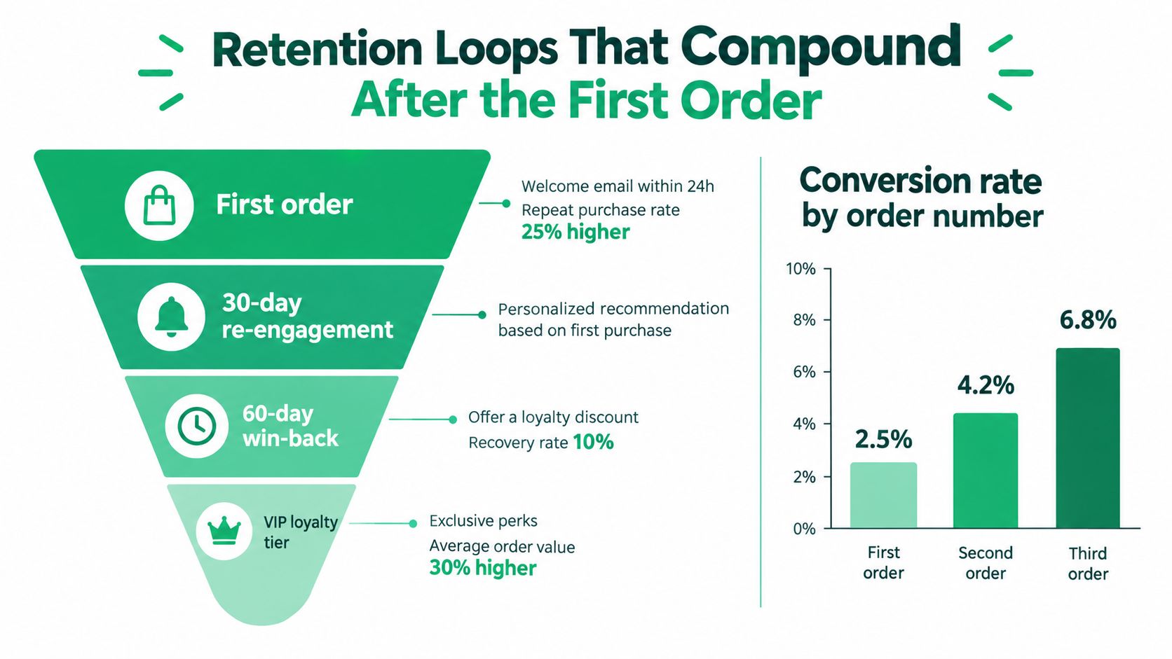
The compounding retention loop
Use the first order to set up the second. Use the second to make the third easier.
Here's the retention loop I prefer:
- Post-purchase add-on: use the first order to improve product adoption, not just raise order value.
- Behavior-based follow-up: send replenishment or accessory messaging based on what the customer purchased and what they ignored.
- Cancellation interception: if they try to leave, offer a pause, a downgrade, or a tighter-fit alternative.
- Loyalty threshold with real reach: make the reward attainable inside the customer's normal reorder window.
These steps should share context. If a customer adds a refill after checkout, your next message should reflect that. If they decline an accessory, stop pushing that accessory and shift to education, replenishment timing, or a different bundle.
Where merchants get loyalty wrong
I see the same mistake in retention audits. Stores launch points, tiers, and referral mechanics before they have a clear second-purchase path. Customers cannot feel progress if the first useful reward sits too far out, and they will ignore a program that asks them to do math.
Keep it simpler and closer to buying behavior:
- Reward the second purchase path instead of a distant milestone.
- Tie perks to product usage such as refill cadence, subscription tenure, or accessory ownership.
- Reserve save offers for real churn risk because constant discounting trains customers to wait for the rescue email.
The stores that win here connect post-purchase behavior to the next profitable action. Top-quartile Shopify teams do not stop at checkout. They use the window after conversion to shape repeat purchase timing, reduce churn, and increase customer value without bloating the offer stack.
Your 30-Day Shopify Revenue Execution Plan
Stores that improve one high-intent surface per week usually beat teams that spend a quarter debating redesigns. Use the next 30 days to fix revenue leaks in sequence: product page, checkout, post-purchase, then retention.
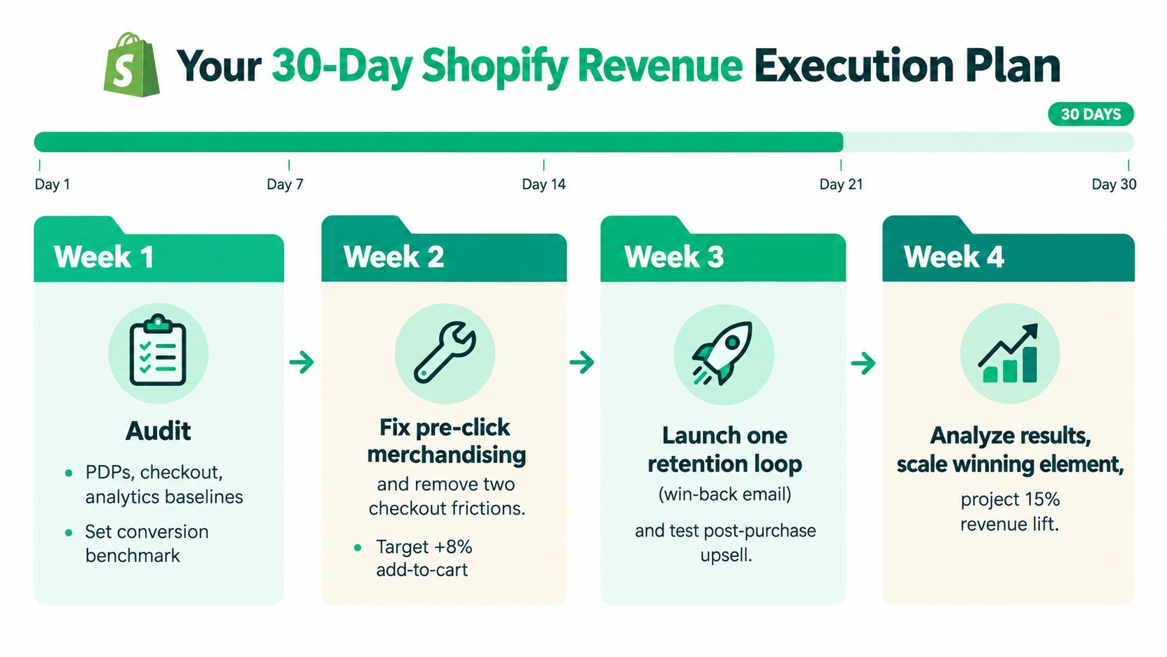
Week 1 audit what drives revenue
Start with the path customers already use. Review your top landing product pages, mobile checkout flow, thank-you page, and order status page.
Document four baselines:
- Add-to-cart rate
- Checkout completion
- Average order value
- Repeat purchase behavior
Then read support tickets tied to address changes, order edits, and "forgot to add item" requests. Those tickets point to missed revenue after the sale and wasted support time. Top-quartile Shopify stores monetize that intent instead of sending it to the inbox.
Week 2 fix the pages and fields
Tighten the top three PDPs first. Simplify the hero section. Put proof near the add-to-cart button. Show shipping expectations before the customer has to hunt for them. Make the mobile add-to-cart action impossible to miss.
Then clean up checkout. Remove at least two non-essential fields and test the flow on real devices, especially lower-end phones on mobile data. If your team wants another operator-level perspective, these CRO strategies for Shopify and WordPress are a useful supplement to your internal review.
Week 3 launch one post-purchase monetization surface
Pick one surface and ship it.
If your catalog is still simple, start with a cart add-on. If you have a proven hero product and stable fulfillment, launch a thank-you or post-checkout offer. Pair that with address validation and order editing so new revenue does not create a support mess.
This is the week that separates stores that stop at checkout from stores that keep monetizing confirmed intent. A customer who just bought is far easier to convert than a cold visitor coming back later.
Week 4 wire the retention loop and cut losers
Add one retention flow based on first-order behavior. Use replenishment timing for consumables. Use education plus cross-sell for products with a longer consideration cycle. Add a cancellation save path if you sell subscriptions.
Keep the loyalty mechanic simple. Customers should understand the next reward without doing math.
Then make hard calls:
- Keep changes that improve the target metric cleanly.
- Revise changes that create clicks but also create support burden.
- Kill changes that confuse customers or weaken the core offer.
CRO teams lose time when they get attached to concepts instead of outcomes. If a test trails control after enough traffic to judge directionally, end it, document the result, and put the next experiment in market.
SelfServe helps Shopify merchants turn the post-purchase window into a working revenue and operations layer. It gives customers controlled order editing, validates addresses, and adds upsell surfaces on Thank You and Order Status pages without forcing support to handle every change manually. If that's the bottleneck in your store, visit SelfServe.