Boost Sales with Conversion Rate Improvement Guide

Most conversion advice starts in the wrong place. It tells Shopify brands to test button colors, rewrite headlines, or chase an industry benchmark as if the goal is to look average on a dashboard.
That isn't how strong operators improve revenue.
For a Shopify Plus brand, conversion rate improvement is less about isolated page tweaks and more about removing friction across the full buying journey. That includes product discovery, checkout completion, and the post-purchase experience that shapes whether a customer buys again, submits a support ticket, or turns a simple order into operational drag.
Average stores measure checkout completion. Better stores measure conversion in context. They look at device mix, support burden, repeat purchase behavior, and whether the customer experience gets easier or harder after the sale.
Rethinking Your Conversion Rate Goals
A higher conversion rate can still hide a weak business.
Many Shopify Plus teams fixate on a blended sitewide number because it is easy to report and easy to compare. That number has some value. Gorgias' ecommerce conversion benchmarks give useful context on average store performance and the gap between mobile and desktop. But context is all a benchmark gives you. It does not tell you whether your acquisition mix is healthy, whether your checkout experience is efficient, or whether new customers turn into profitable repeat buyers.
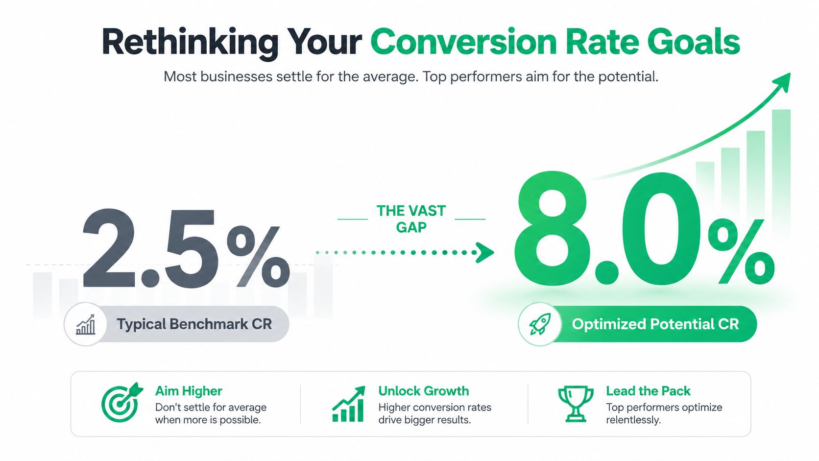
Average performance is often expensive performance. If paid social costs are rising, discounting is heavy, and support volume spikes after every promotion, matching a benchmark does not mean the store is healthy. It means the store is keeping up with a crowded market.
A better question is operational: are you converting the traffic you already paid for into orders that are profitable to fulfill, easy to support, and likely to purchase again?
That standard changes what teams optimize.
A first order from a customer who immediately opens a ticket to edit shipping details, asks where the package is, and never returns is worth less than a first order from a customer who checks out cleanly, gets clear post-purchase communication, and comes back within 60 days. Both count as conversions in Shopify. Only one improves the business in a durable way.
Practical rule: Do not chase a prettier conversion rate if the path after checkout creates more support work, more exceptions, and weaker repeat purchase behavior.
Benchmarks are a starting line
Benchmarks help set range, spot outliers, and pressure-test assumptions. They are useful for board conversations and monthly reporting. They are less useful as a target by themselves.
For Shopify Plus operators, conversion goals should reflect four things at once:
- Session-to-order efficiency: How effectively traffic turns into completed orders without relying on margin-eroding tactics.
- Channel and device quality: Which sources produce customers who buy cleanly, and which ones bring high drop-off or low-intent sessions.
- Operational load: Whether growth creates extra burden for support, fulfillment, and order management teams.
- Repeat purchase potential: Whether the experience after the first order increases the odds of a second order and stronger LTV.
The primary target is profitable efficiency.
I have seen brands celebrate a lift on a landing page while returns, WISMO tickets, and order-edit requests climbed in the background. On paper, conversion improved. In practice, margin got squeezed and the team inherited more manual work. That is why conversion goals need to include the post-purchase experience, especially for brands with enough order volume for small process issues to become real cost centers.
If reporting still treats conversion as one blended sitewide percentage, fix the measurement layer first. A practical guide to tracking Shopify analytics for smarter decisions will help you build reporting that separates channel quality, device behavior, and post-purchase outcomes instead of lumping everything into one headline number.
Strong brands do not just get more orders. They get better orders, with less friction after the sale.
Finding the Leaks in Your Funnel
Most stores already have enough data to find their biggest conversion problems. They just don't use it in the right sequence.
The standard that holds up is the five-step CRO cycle: Measure, Analyze, Hypothesize, Test, and Implement. Teams that rely on intuition instead of that process make the wrong call about 50% of the time, according to Inspectlet's guide to improving conversion rates.

That matters because most CRO mistakes aren't creative mistakes. They're diagnosis mistakes. Teams test the visible thing instead of the broken thing.
Start with the funnel, not the page
A product page with mediocre engagement isn't always your biggest issue. Sometimes the underlying problem sits one step later in cart, shipping, payment, or mobile form completion.
A useful funnel review for Shopify Plus usually asks:
- Where is the largest drop-off?
Look at the path from product view to add-to-cart, cart to checkout, checkout to order. - Who is dropping off?
Segment by device, landing page, traffic source, and new versus returning customer. - What changed?
Compare drop-offs before and after merchandising changes, theme edits, app installs, shipping policy changes, or promo launches.
If cart abandonment is already high, that deserves immediate attention. A focused review of Shopify cart abandonment patterns is often more valuable than another round of homepage edits.
Combine quantitative and qualitative evidence
Shopify Analytics and GA4 tell you what happened. Heatmaps, session recordings, and support logs help explain why.
Use them together:
| Evidence type | What it reveals | What to do with it |
|---|---|---|
| Funnel data | Step-by-step drop-off | Prioritize the highest-friction stage |
| Device segmentation | Mobile versus desktop underperformance | Check mobile layouts, forms, and payment flow |
| Session recordings | Hesitation, repeated clicks, backtracking | Identify confusing interactions |
| Heatmaps | Ignored CTAs or misplaced attention | Fix hierarchy and page structure |
| Support conversations | Repeated objections and confusion | Turn questions into on-page answers |
Weak testing programs usually fail. They gather one type of evidence and stop. For example, they notice cart exits but never watch sessions. Or they collect support complaints but don't map them to the funnel.
Watch enough recordings from abandoning users and patterns become obvious. People don't leave because they hate your brand. They leave because something feels unclear, risky, slow, or annoying.
Prioritize leaks by business value
Not every leak deserves the same urgency. A problem on a high-traffic product template is more valuable than a cosmetic issue on a low-volume collection page. A checkout friction point that also creates support tickets is more valuable than a copy tweak with unclear downstream impact.
A simple prioritization filter works well:
- High impact and high confidence: Broken flows, confusing forms, payment friction, hidden costs.
- High impact and medium confidence: Product page messaging gaps, unclear shipping expectations, weak mobile UX.
- Low impact but tempting: Button color tests, minor layout preferences, cosmetic homepage edits.
Good diagnosis reduces wasted testing. It also forces teams to stop defending assumptions that the data doesn't support.
Optimizing Your Product Pages and Checkout
Product page wins rarely come from prettier design. They come from reducing the buyer's workload.
On Shopify Plus, that means answering the purchase questions that block action, loading the page fast enough to keep intent alive, and keeping checkout focused on completion instead of data collection. Teams that skip that order often spend months testing copy and creative while the actual drag sits in performance, clarity, and form friction.
Start with the moments that shape buying confidence
Shoppers make a series of small yes-or-no decisions before they ever reach payment. Can I trust this product? Will it arrive when I need it? Is the price really the price? What happens if I need to change something after I buy?
That last question matters more than many teams expect. If a customer suspects that a simple post-order fix will turn into a support ticket, hesitation starts on the product page, not after checkout. Brands that pair clear PDP messaging with a strong Shopify post-purchase upsell and order edit strategy usually see a cleaner path from first purchase to repeat purchase because the whole buying experience feels easier to recover from if plans change.
Fix speed before merchandising polish
Performance affects revenue and efficiency at the same time. Faster product pages keep more shoppers engaged, and they usually lower the amount of paid traffic wasted before the page has even rendered.
Focus on the first visible experience:
- Load the hero media and buy box first: Shoppers should see the product, price, core value proposition, and add-to-cart path quickly.
- Cut script bloat: Loyalty widgets, review apps, quiz tools, and tracking scripts all compete for performance. Audit every app by revenue contribution, not by habit.
- Check mobile separately: A page that feels fine on office Wi-Fi can still stall on a real customer's phone.
As noted in Valiotti's CRO analysis, faster load times, stronger user-generated content, and fewer form fields all correlate with better conversion performance. The practical takeaway is simple. Remove delays before rewriting headlines.
Make the product page answer objections before support has to
Strong PDPs do not just persuade. They prevent uncertainty from building.
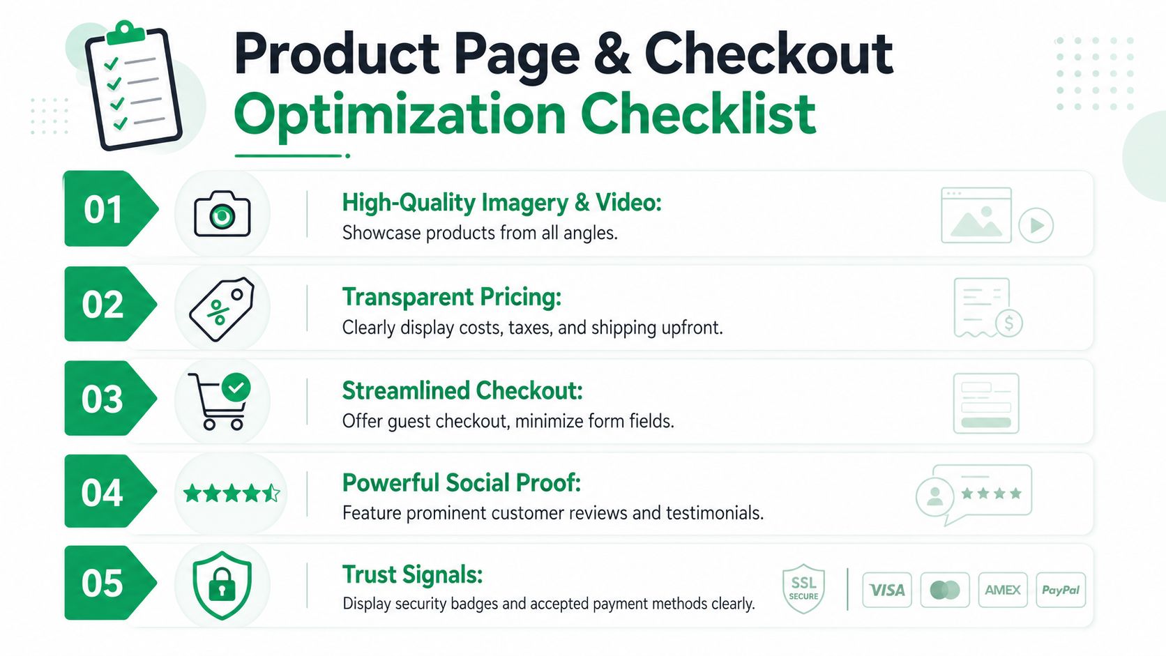
The highest-impact product page improvements usually sit close to the buy box:
- Specific product imagery: Show scale, texture, variation, and real-world use.
- Proof with context: Ratings, reviews, and customer photos should answer fit, quality, and usage concerns, not just signal popularity.
- Visible delivery expectations: State shipping timing, thresholds, and exceptions in plain language.
- Straight pricing: Show total value clearly and avoid forcing customers to discover surprise costs later.
- Fit, compatibility, or usage guidance: Reduce the risk of choosing the wrong item.
A useful operating rule applies here. If support or chat keeps answering the same pre-purchase question, that answer belongs on the page.
Strip checkout down to the work required to place an order
Checkout conversion improves when the path feels short, obvious, and forgiving. Every extra field, decision, or error state asks the customer to do more work than they expected.
Review checkout in this order:
| Priority | What to review | Why it matters |
|---|---|---|
| First | Required fields | Collect only what fulfillment, fraud review, or tax handling actually needs |
| Second | Guest checkout | Removes account creation as a barrier to first purchase |
| Third | Error handling | Helps customers recover quickly instead of abandoning on vague validation messages |
| Fourth | Payment options | Lets ready buyers use the method they trust |
| Fifth | Mobile keyboard flow | Reduces friction for the majority of checkout sessions on phones |
There are trade-offs here. Some brands add fields for marketing enrichment, delivery instructions, or internal operations. Those fields can help downstream teams, but they still cost conversion. If the information is not required before payment, collect it later or infer it from existing data.
Prioritize the fixes that change completion rate
Small visual tweaks get too much credit in checkout work. A nicer button treatment will not offset hidden shipping costs, weak delivery messaging, or a checkout that feels longer than it should. Coupon fields are another common culprit. They often send buyers off-site to search for a discount instead of finishing the order.
A practical sequence works better:
- Improve speed and mobile rendering.
- Answer product-level objections near the buy box.
- Remove unnecessary checkout fields and choices.
- Tighten error recovery and payment flexibility.
- Test merchandising and persuasion changes after the path is already easy to complete.
That order tends to raise conversion rate without creating avoidable support load later. For Shopify Plus brands, that matters. Good CRO should increase revenue and reduce operational drag at the same time.
The Untapped Goldmine of Post-Purchase Optimization
Most CRO advice stops at checkout. That's a mistake.
For a Shopify Plus brand, the moment after payment often determines whether the order becomes profitable growth or expensive cleanup. If customers can't fix a simple mistake, update basic order details, or understand what happens next, support volume rises and trust falls. You may still count the first conversion, but you've damaged the second one.
A smooth post-purchase experience can increase repeat purchase rates by 22%, while friction from simple requests like shipping address changes can drive up to 30% higher support ticket volume for DTC brands, according to SiteTuners' analysis of conversion and post-purchase friction.
Why post-purchase friction hurts conversion
This problem is easy to miss because it doesn't always show up in a standard checkout report.
The customer buys, then immediately realizes they entered the wrong apartment number, used an old email, or wants to add one more item. If the only option is to contact support and wait, the experience shifts from smooth to fragile.
That creates knock-on effects across the business:
- Support teams absorb avoidable work: Tickets rise for issues customers should be able to handle cleanly.
- Operations get interrupted: Manual changes increase the chance of errors and internal back-and-forth.
- Customers lose confidence: A simple issue becomes a trust problem.
- Repeat purchase intent weakens: The store feels harder to buy from next time.
Traditional CRO frameworks rarely treat this as a conversion issue. It is one. It affects repeat purchase behavior, support cost, and the customer's willingness to increase order value after checkout.
The best conversion programs don't end at payment. They continue until the customer feels the order is under control.
The thank-you page is not a receipt page
Many brands waste one of their highest-intent touchpoints.
After checkout, the customer is still engaged. They have context, momentum, and a live order. That makes the thank-you page and order status page useful places to present relevant add-ons, explain next steps, and reduce anxiety.
A thoughtful approach to Shopify post-purchase upsell strategy can improve the value of existing demand without forcing the buyer back through a cold acquisition funnel.
The key is restraint. Post-purchase offers should feel helpful, not opportunistic. The strongest examples usually share three qualities:
- Relevance: The additional item makes sense with the original purchase.
- Timing: The offer appears while purchase intent is still warm.
- Low friction: The customer doesn't need to restart the whole buying process.
Used properly, post-purchase optimization does two jobs at once. It creates incremental revenue and reduces the likelihood that the customer associates your brand with administrative hassle.
Operational wins are revenue wins
At this stage, ecommerce and operations stop being separate conversations.
When a customer can make approved post-purchase changes without opening a ticket, support has more time for complex issues. Operations handle fewer edge cases. The customer gets a cleaner experience. That is not just a service improvement. It supports conversion efficiency across the customer lifecycle.
Here is the strategic point many brands miss: a store that feels easy to buy from after the order is placed is also easier to buy from before the next order starts.
A short walkthrough helps make that model concrete:
When operators connect support tickets, post-purchase friction, repeat purchase behavior, and average order value, conversion work gets much sharper. It stops being limited to front-end page design and starts affecting the whole revenue system.
Implementing and Measuring Your Experiments
Execution is where a lot of CRO programs stall. Teams spot real friction, agree on the problem, then burn a quarter debating test ideas that will never produce a meaningful outcome.
The fix is a stricter decision rule. Give engineering time to changes that remove clear buying friction, reduce support cleanup, or improve order quality. Save low-stakes creative debates for later.
For lower-traffic stores, that distinction matters even more. If your site gets under 5,000 monthly visitors, structural changes usually beat minor A/B tests. In that environment, implementing guest checkout can increase conversions by 15% to 25%, while real-time address validation can reduce errors by 40% and boost mobile conversion by 18% on Shopify, according to NielsenIQ's conversion rate optimization findings.
Prioritize changes by certainty and impact
A useful test queue separates ideas into three buckets:
| Bucket | Typical examples | Best action |
|---|---|---|
| Broken or clearly harmful | Friction-heavy forms, missing guest checkout, poor mobile address entry | Ship the fix and monitor |
| High-confidence improvements | Better product proof placement, cleaner checkout hierarchy, clearer shipping copy | Test if traffic allows, otherwise roll out carefully |
| Debatable preferences | Button styling, headline nuance, minor layout polish | Test later, not first |
Shopify teams often waste time by treating all experiments as equal. They are not equal. A checkout fix that removes effort for the customer and cuts preventable support tickets usually deserves priority over a homepage test that changes color, spacing, or copy tone.
If you're looking for a broader framework on how to turn website traffic into revenue, that resource is useful because it keeps the focus on business outcomes rather than vanity tests.
Measure more than the conversion rate
A good experiment improves the business as a whole.
For Shopify operators, the scorecard should usually include:
- Primary conversion metric: Order completion, checkout completion, or product-page-to-cart progression
- Average order value: Did the change improve basket quality?
- Support ticket impact: Did the change remove confusion or create more cleanup?
- Mobile versus desktop performance: Did the fix help the traffic mix you have?
- Post-purchase friction signals: Are customers hitting fewer avoidable issues after the sale?
That last metric gets ignored too often. If a test lifts conversion but increases order edits, shipping complaints, or "where is my order" contacts, the gain is weaker than it looks. Revenue quality matters. Operational drag matters too.
Measurement rule: If a change lifts conversion but creates more support burden or weakens order quality, it may not be a win.
Use hypotheses that are specific enough to fail
"Improve checkout" is not a hypothesis. "Reduce friction in the shipping step by removing unnecessary fields and improving address entry" is specific enough to implement, review, and reject if it does not perform.
The strongest teams document three things every time:
- What problem they observed
- What change they made
- What business metrics moved afterward
That record becomes an operating asset. Over time, the team gets sharper about which issues are worth fixing first, which changes produce durable gains, and which ideas looked persuasive in a meeting but did nothing in the store.
Building a Durable Conversion Culture
Strong conversion rate improvement doesn't come from a one-time redesign. It comes from a company habit.
That habit is simple to describe and harder to maintain. Teams look at real customer behavior, identify friction, fix the highest-value issues first, and measure whether the change improved the business. Then they repeat it.
What durable teams do differently
The most effective Shopify brands tend to share a few operating behaviors:
- They trust diagnosis over opinion: Data and observed behavior outrank internal preference.
- They optimize the whole journey: Product page, checkout, and post-purchase all count.
- They connect CX with operations: Support burden is treated as a conversion signal, not a separate problem.
- They document what they learn: Wins and losses both shape the next round of decisions.
This mindset matters because customer expectations don't stay still. Merchandising changes, app stacks change, acquisition mix changes, and the small frictions that didn't hurt last quarter can start hurting now.
A durable conversion culture isn't built on clever tests. It's built on teams that keep removing effort from the customer's path to buying and buying again.
For Shopify Plus brands, that's the standard worth aiming for. Not a benchmark screenshot. Not a prettier PDP. A store that converts efficiently, scales cleanly, and keeps earning the next order.
If post-purchase friction is creating support tickets, slowing operations, or limiting repeat purchase potential, SelfServe is worth a look. It helps Shopify brands give customers controlled self-service options for order changes, adds post-purchase upsell opportunities, and reduces the manual work that often sits between a completed checkout and a strong customer experience.