Shopify Order Status Page: The Complete 2026 Guide
Right after checkout, the customer is still paying attention. They're looking for proof that the order exists, a clear next step, and a place to check progress without opening a support ticket. If that handoff is messy, your team inherits the same question over and over, and the post-purchase experience starts to feel like a support gap instead of a service layer.
The Shopify order status page is where that moment gets resolved. Shopify positions it as the final page of checkout and the place customers can return to after purchase to track shipping progress, with real-time updates available when the shipment uses a supported carrier and tracking numbers have been added. Shopify also makes the page available to merchants from the admin, which means the same order record can support both customer self-service and internal troubleshooting in one workflow. Shopify's order status page documentation sits at the center of that logic, but the business value shows up in support deflection, cleaner fulfillment handoffs, and a more usable post-purchase journey. For teams comparing broader platform capabilities, compare UK online store platforms if you want to benchmark how different ecommerce stacks handle post-purchase visibility.
The strongest merchants treat that page as the customer's default answer to “what happens now,” not as a receipt screen. That's why it belongs in the same conversation as post-purchase experience design, not just checkout operations. If you're mapping the whole journey, the broader framework in post-purchase customer experience is the right lens, because the order status page is where service, trust, and conversion start to overlap.
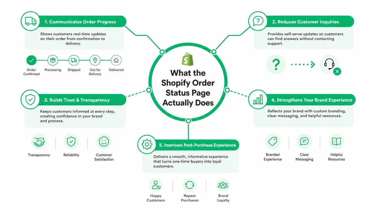
What the Shopify Order Status Page Actually Does
The customer lands on the order status page with one question in mind, whether the order is real and what's happening next. Shopify's own help center describes it as the place customers can track their order after purchase without contacting support directly, and once tracking numbers are added, they can come back to see shipping updates. That makes the page the practical bridge between checkout confirmation and fulfillment visibility, not just a static thank-you screen. Shopify's order status page help article is explicit about that role.
Three jobs the page has to do well
First, it confirms the order exists. Second, it shows movement as fulfillment advances. Third, it gives the shopper a reason to return to the same URL instead of emailing your team for every status check.
Practical rule: if the page doesn't answer the next obvious question, it will get replaced by a support ticket.
That matters because the order status page is structurally different from the thank-you page. The thank-you page is a one-time confirmation, while the order status page is the reusable post-checkout destination customers revisit throughout fulfillment. Shopify's admin reflects that same logic, with the order status page reachable from the Orders area and reporting available separately in Analytics, so operations teams can analyze orders over time and then drill into a single order when a shopper needs help. Shopify order analytics docs
The result is simple. For high-volume stores, this page becomes the most repeated support surface in the entire post-purchase journey. That's why it belongs in the same playbook as post-purchase experience planning, not as an afterthought in checkout setup. A strong page reduces uncertainty, gives customers a place to self-serve, and keeps your inbox from becoming the default tracking interface.
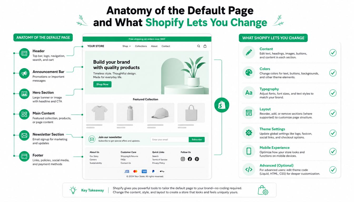
Anatomy of the Default Page and What Shopify Lets You Change
Shopify's default page structure is more useful than most merchants realize, but it's not a blank canvas. Out of the box, the page typically needs to show the order summary, line items, shipping address, shipping status, contact information, and recommended products. Those blocks give customers enough context to verify the order, check progress, and see what's next without digging through email threads.
What is editable and what stays Shopify-owned
The big mistake is assuming this page works like a fully open theme template. It doesn't. Shopify owns the core order logic and authenticated order state, so you can't rewrite the underlying fulfillment behavior from a theme file. You can usually restyle presentation layers, adjust assets, and shape the surrounding experience, but the actual order data, status behavior, and access rules live inside Shopify's system.
That separation is why the admin view matters. Shopify says merchants can open an order and choose View order status page, but the customer-facing experience still depends on login and order access rules. The page is both customer self-service and a restricted support view, which is exactly why it's useful and also why it has limits. Shopify's customer account and order status page docs make that split clear.
For merchants trying to compare platform flexibility, the right implementation choice starts to matter here. If you only need a visual refresh, theme-level changes are enough. If you need logic, conditional content, or checkout-adjacent behavior, you're in extensibility territory. Shopify Plus gives you more room to work through checkout and post-checkout extensibility, while standard stores usually need to stay within the narrower theme and app surfaces.
If your team is also revisiting the checkout itself, modify Shopify checkout page is the adjacent topic worth reviewing, because the order status page sits downstream of those decisions and inherits whatever data and workflow quality you create upstream.
Three Layers of Customization for Merchants and Developers
The smartest teams don't start with an app install. They start by asking what kind of change they need, because the right layer depends on whether the goal is branding, logic, or self-service operations. A logo update and a support workflow are not the same problem.
Theme layer for presentation
Theme work is where you handle colors, typography, spacing, and the kinds of visual adjustments that make the page feel aligned with the rest of the storefront. If the ask is “make the page look native,” that belongs here. If the ask is “change what happens when an order enters a certain state,” it doesn't.
Plus layer for logic and checkout-adjacent control
On Shopify Plus, checkout extensibility and related script-based tooling give merchants more room for conditional behavior and custom fields. That's where you get into logic that needs to react to order attributes, customer type, or fulfillment context. A B2B field, a conditional message, or a more complex post-purchase rule belongs in this layer because the theme alone can't safely manage it.
App layer for operational widgets
Third-party apps fill the gap when the business wants customer actions on the status page itself, like address edits, cancellations, or upsells tied to post-purchase state. SelfServe is one example of that category. It adds customer-facing post-purchase change tools, including order editing and upsell modules, while letting merchants keep control over permissions and timing. That makes it an app-layer solution, not a theme substitute.
The layer you choose should match the risk of the change. Branding changes are cheap. Workflow changes need guardrails.
That decision tree matters more than feature shopping. A logo swap is theme work, a dynamic upsell is app work, and custom workflow logic often needs Plus-level control. Shopify post-purchase upsell guidance is useful here because it shows how revenue features fit into the same surface without pretending every store needs the same stack.
A Real Order Status Page Flow With SelfServe and Shopify
Maya places an order on a DTC store, then lands on the order status page expecting the usual basics, confirmation, shipping progress, and a way to check back later. Instead of a dead-end tracking screen, the merchant has turned the page into an action surface. Maya can update her shipping address through a widget, the new address is validated against Google Maps autocomplete, and the page renders in her language without her needing to switch anything manually.
That's the important part. The page still feels like Shopify, but the merchant has added useful actions around it. The customer sees a change-order block, the address entry is cleaned up before fulfillment becomes messy, and the page can present a relevant upsell without sending her somewhere else.
What the merchant sees behind the scenes
When Maya submits the address change, the order can be tagged automatically, then routed into a manual approval queue if the merchant wants human review. If the change is approved, the updated address can be pushed downstream to the 3PL instead of living only in a support note. That closes the loop between customer action and warehouse execution.
The upsell module works the same way. Maya adds a complementary product from the order status page, so the store gets incremental revenue at a point where the customer is still engaged with the order. The merchant doesn't need to chase her through email or hope she comes back through the storefront.
Why this flow matters operationally
Post-purchase stops being passive here. The customer gets self-service, the support team gets fewer routine tickets, and the fulfillment team gets cleaner data. Multilingual rendering also removes a lot of friction for international shoppers, because the page can adapt to the buyer instead of forcing the buyer to adapt to the page.
That combination is why order status pages are worth treating like a workflow, not a widget. They can absorb address correction, surface an upsell, and keep the order record aligned across support and fulfillment in one session.
Best Practices for UX, Conversion, and Multilingual Reach
A useful order status page has to do more than look polished. It needs to be readable on first pass, useful on repeat visits, and safe enough that a shopper can act without second-guessing the result. If the layout gets crowded, or if the primary tracking state is buried under offers, the page loses the trust that makes it valuable in the first place.
Put the most important action where attention already is
The tracking block should stay visible and easy to scan. If you place an upsell, put it where the shopper is already finished with the status information, not where it competes with the shipment update. Merchants often make the mistake of stacking too many offers on top of the thing customers came to see.
Address edits need a narrow window too. Letting a customer edit shipping details after fulfillment has already moved creates operational noise, especially if the label is out the door. Close the edit window before the order is too far into fulfillment, and the workflow stays predictable.
Use language detection, not a manual toggle
For multilingual stores, the cleanest approach is automatic rendering based on the shopper's browser locale and the store's published languages. A separate language switch can work, but it adds friction at exactly the moment you want the page to feel effortless. The best version is the one customers don't have to think about.
Usability rule: the order status page should answer the status question faster than an email can be written.
Accessibility matters here too. Keep focus order logical, make contrast strong on status states, and don't rely on color alone to signal progress. If the page is going to be revisited several times, it has to stay readable on mobile, in different languages, and in a support context where people are moving fast.
The conversion angle is real, but the sequence matters. Track first, present helpful actions second, and keep the page calm enough that shoppers trust it. That's the difference between a useful post-purchase surface and a cluttered upsell block.
The Security Trade-Off Most Guides Skip
The awkward truth is that the same controls that protect customer data can slow down support. Shopify says merchants can open an order and choose View order status page, but the page is still tied to customer login. In practice, that means staff often can't just click in and see the full customer-facing state the way they expect.
That friction shows up most during WISMO tickets. A support agent wants to confirm exactly what the shopper sees, but they may need the customer's email and order number to load full details from admin, based on community reports in 2025. That trade-off is easy to overlook until the queue is full and agents are stuck chasing access instead of resolving the problem.
Why the restriction exists
The privacy logic is straightforward. The page contains order-specific personal data, shipping details, and authenticated state, so Shopify keeps the experience gated instead of turning it into a public lookup tool. That protects customers, but it also means merchant support workflows need a different design than a typical CRM view.
What operators do about it
The cleanest workaround is to structure support around the page instead of around ad hoc browsing. Agents can send the direct status URL in replies, use approved customer impersonation workflows where available, or lean on apps that expose scoped support sessions without opening up the full account surface. A good conversion rate optimization guide will tell you to remove friction from the path to action, and this is one of those places where that principle applies just as much to support as it does to sales.
A practical rule helps here:
Do not promise instant internal visibility unless your access model actually supports it.
That's the part most guides miss. The order status page is not just a shopper convenience. It's also a privacy boundary. Merchants who respect that boundary, then build support workflows around it, usually get better resolution speed than teams trying to force the page to behave like an open admin screen.
KPIs to Measure and Rollout Checklists That Actually Ship
The easiest way to waste the order status page is to make changes without a measurement plan. Merchants need to know whether the page is reducing support load, improving edit accuracy, or creating enough incremental revenue to justify the workflow. Developers need the implementation details tracked in a way that makes attribution possible.
Merchant rollout checklist
Week 1 should focus on baseline tracking and visual polish. Confirm that the tracking block renders cleanly, that the page is readable on mobile, and that your support team has a shared playbook for where to find order details.
Week 2 is where address edits and upsells can go live. Tie the edit window to a clear fulfillment cutoff, and make sure the upsell appears in a place that doesn't bury the shipment status. Watch whether customers use the edit flow without creating more back-and-forth with support.
Week 4 is the operational layer. Add cancellation queues if your workflow needs them, and automate tags so the order record reflects what happened on the page. That's when the page starts behaving like a post-purchase system instead of a static confirmation screen.
Developer checklist
Instrument the events that matter, especially page view, edit submission, upsell acceptance, and cancellation request. Make sure app embeds are toggled correctly in the theme editor, and verify that Liquid overrides don't break the default order information customers expect to see.
You also want the handoff to be explicit. If a customer edits an order, that event should be visible where support and fulfillment work. Otherwise you'll have a nice front end and a messy back end.
The page pays off when both teams see the same truth. Merchants should measure support deflection and order-change quality. Developers should measure whether the workflow is stable enough to trust at scale.
If you want a cleaner way to turn the Shopify Order Status Page into a support deflection and revenue surface, SelfServe is built for that kind of post-purchase workflow. It lets customers edit orders within defined windows, add upsells on the thank-you and order status pages, and keep multilingual post-purchase actions tied to the same order record.