Thank You Page Design That Converts on Shopify
Your customer just paid, the order is in, and the next screen can either calm the buyer or create friction. That moment is often treated like a formality, but on Shopify it's one of the few pages people read closely. A good thank you page design turns that pause into clarity, support deflection, and a clean next step.
Most guides still frame the page as a confirmation message with a button attached. That's too small a job. Modern CRO guidance treats it as a dedicated post-conversion page, one that confirms the action, explains what happens next, and gives the shopper one dominant path forward, which is exactly why it behaves more like a revenue and operations surface than a courtesy screen. The page sits inside a high-intent moment, after conversion, when trust is already established and attention is unusually focused, so the language and layout matter more than they do almost anywhere else in the funnel. See the broader post-purchase context in this Shopify post-purchase customer experience guide.
Why the Thank You Page Is Your Quietest Revenue Surface
A Shopify thank you page is easy to dismiss because it does not look like a sales page. That is the mistake. The visitor has already bought, signed up, downloaded, or registered, so the page is no longer fighting for initial attention. It is working after commitment, when a shopper is most open to reassurance or a relevant next step. Current best-practice guidance treats this as a dedicated URL rather than an inline success message, because a dedicated page gives you room to confirm, guide, and extend the transaction without interrupting checkout flow.
That matters for DTC and ecommerce operators because the page can do more than say thanks. It can support repeat purchases, reduce support friction, and surface useful actions like order edits, upsells, surveys, referrals, or tracking. The screen becomes a lightweight operations layer and a conversion extension at the same time.
What the page is really doing
The job is not to impress. It is to remove uncertainty quickly, then offer a single useful action. If the copy tries to do too much, the shopper loses the thread and the page becomes a dead end instead of a continuation.
Practical rule: if the customer still needs certainty, give them certainty first. Only after that should you ask for another click.
For Shopify merchants, that usually means the page should answer three questions in plain language, what happened, what happens next, and what the shopper can do now. If you are building this into a broader post-purchase system, the operational view is covered well in post-purchase customer experience operations, where the same moment is treated as a controllable workflow instead of a static receipt.
Shopify teams that care about conversion performance often pair that workflow with a broader optimization plan. The same page can support reassurance and post-purchase revenue without turning into clutter, which is why it belongs in the same conversation as boost Shopify checkout conversions.
Goals and KPIs Worth Measuring
A thank you page can only be judged against the job you've given it. If the goal is more revenue, then measure revenue. If the goal is fewer support tickets, measure the deflection path, not just clicks. If the goal is retention, watch whether the page sends people to a second purchase path, a review flow, or a referral action.
For Shopify teams, the most defensible scorecard usually starts with incremental AOV from post-purchase offers, repeat purchase behavior, and support ticket deflection. A referral or review CTA belongs in the same conversation if it's part of the page design, but it shouldn't crowd out the main task. For a helpful companion on how to connect page changes to broader funnel work, see boost Shopify checkout conversions.
What to track weekly and quarterly
Weekly, watch the page elements that can move fast, primary CTA clicks, upsell acceptance, and order-edit or support-link engagement. Quarterly, look for patterns in repeat purchase behavior, refund-related contacts, and whether the page is helping or hurting post-purchase confidence.
If you have no baseline, start with the current template and treat it as the control. Then compare every new version against that version only. Don't chase perfect attribution on day one. You're looking for directional evidence that the page is doing a real job, not just looking cleaner.
| Thank You Page KPI | Page Element | Why It Matters |
|---|---|---|
| Incremental AOV | Post-purchase upsell module | Shows whether the page adds revenue after checkout |
| Support deflection | Order details, help links, self-service edits | Reduces tickets that would otherwise reach support |
| Repeat purchase behavior | Secondary offer or collection CTA | Indicates whether the page can extend the relationship |
| Referral or review conversion | Single clear CTA | Measures whether the page moves shoppers into advocacy |
A clean dashboard should make it obvious which element is carrying the load. If the upsell is strong but support deflection is flat, the page is doing one job and missing another. If everything is flat, the page is probably asking too much of the shopper or hiding the useful action too far down.
Essential Elements Every Page Needs
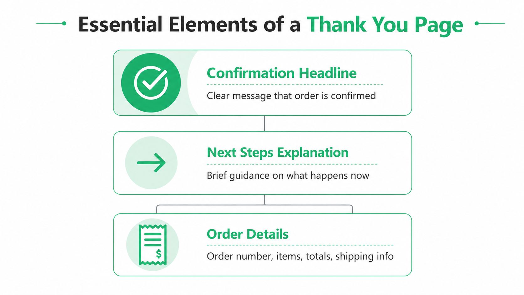
The strongest thank you page design starts with a simple hierarchy. First comes the confirmation headline, then a short next-step explanation, then order-specific details, then one primary action. Anything extra belongs below that line, visually subordinate and clearly optional.
The order should feel obvious
A confirmation headline should read like a checkpoint, not a marketing slogan. The next line should say what happens now, such as when the shopper can expect tracking, a receipt, or access to the next step. After that, include order details that reduce uncertainty, order number, purchased items, quantities, prices, discounts, receipt or download options, and an order-tracking link where relevant.
The primary CTA should be the only action that visually competes for attention. Secondary actions, like support links or testimonials, can exist, but they should never pull the eye away from the main task. That's especially true after checkout, where confusion is more expensive than missed attention.
Where upsells fit without crowding trust
Post-purchase upsells belong after the confirmation block, not before it. If they appear too early, the page feels like it's trying to renegotiate the sale the customer just made. If they appear too late, they'll be ignored.
The best versions keep the confirmation visually stable and then add a curated offer beneath it. That offer works best when it feels like an extension of the original order, not a random add-on. The same logic applies whether you're presenting a single product, a collection, or a follow-up action tied to support.
When teams get this wrong, they usually pile in too many CTAs, links, and badges. The page starts looking busy, and busy is the enemy of post-conversion clarity.
Layout Patterns That Keep the Page Focused
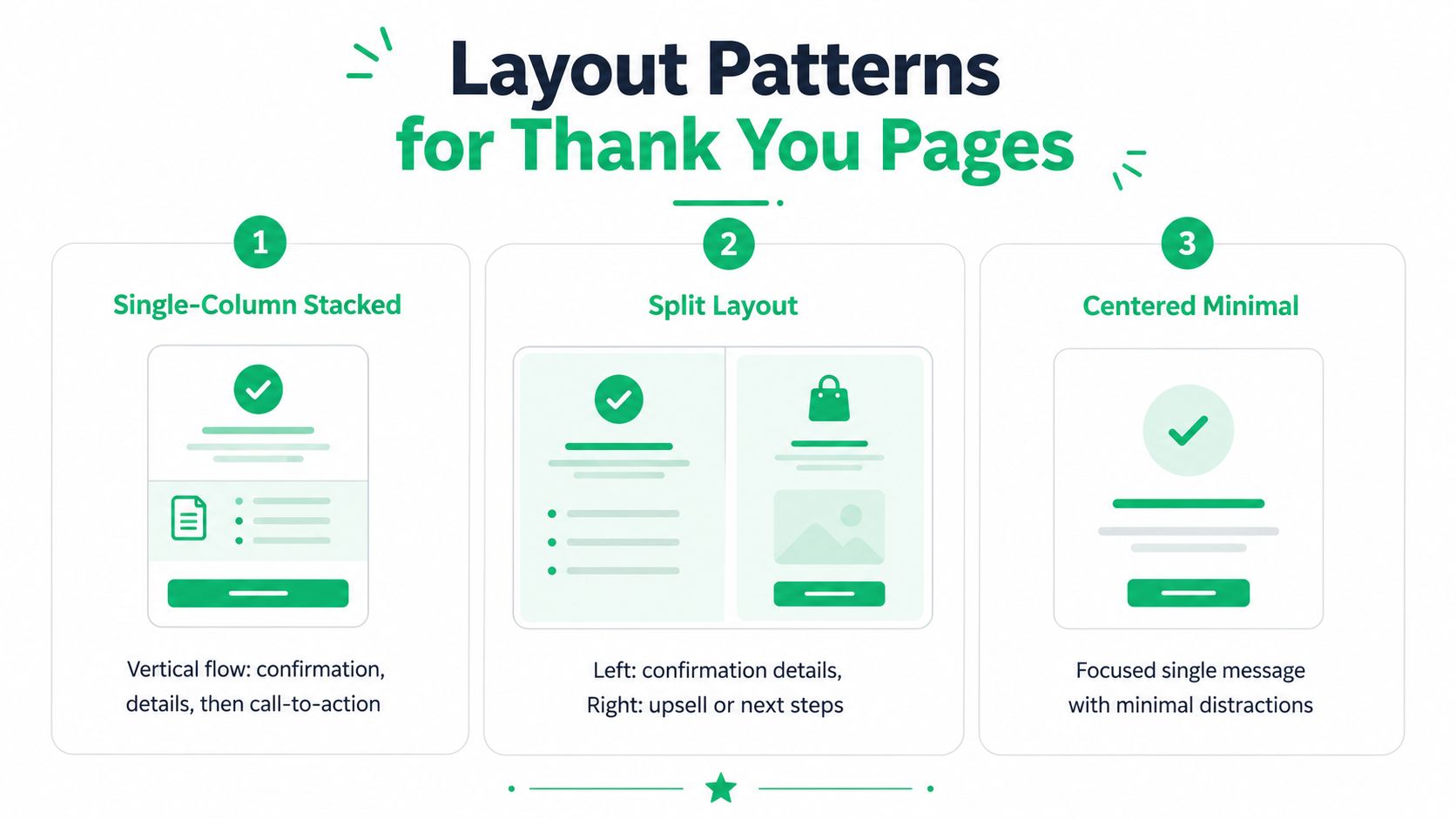
Layout decides whether the page reads like a clean handoff or a crowded bulletin board. In Shopify, I've seen three structures work consistently, a single-column stack, a split layout, and a centered minimal page. Each one can work, but each one serves a different kind of merchant.
Which layout fits which brand
A single-column stack is the safest choice when you want clarity and a predictable reading order. It works well for brands with moderate order complexity, because the shopper can scan confirmation, details, and the next step without splitting attention.
A split layout can work when the left side handles the confirmation and the right side carries a tidy upsell or follow-up action. This is useful when the post-purchase offer is important but still needs to stay secondary to the order summary. The risk is obvious, if the right rail becomes louder than the confirmation, the design starts to feel like a sales pitch.
A centered minimal page is best when brand restraint matters more than surface area. Premium brands often prefer this because it keeps the page elegant and avoids clutter that can cheapen the experience.
What to remove before you ship
Strip out anything that behaves like a second homepage. Navigation menus, crowded footers, and a stack of competing buttons make the user work harder than they should after paying. The page should not restart browsing behavior.
A tight visual hierarchy works because it matches intent. One headline, one sentence, one primary action. The rest should be deliberately quiet.
Keep the page short enough that a shopper can understand it on one pass. If they have to hunt for the next step, you've already lost momentum.
Designing for Mobile and Multilingual Shoppers
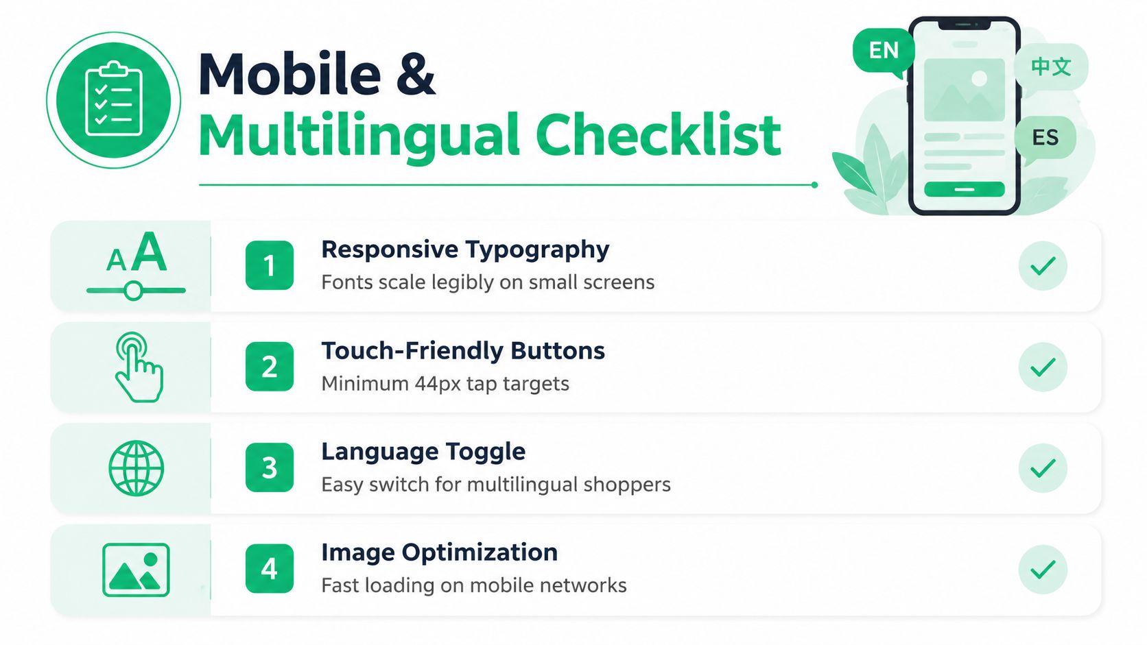
On mobile, thank you page design lives or dies on touch accuracy and readability. The shopper just completed a transaction on a small screen, so the page has to feel effortless, not fiddly. A primary CTA should appear above the fold, body text should be readable without zooming, and buttons should be large enough to tap cleanly, with guidance that points to touch targets of about 44px by 44px.
Make the page easy to operate with one hand
Keep the order summary compact. If the receipt area forces pinch-zoom or horizontal scrolling, the page is working against the user. The same goes for tiny buttons that sit too close together, because accidental taps create frustration at exactly the wrong moment.
Localisation matters just as much as spacing. Shoppers should see the storefront language reflected in the copy, the upsell text, the support links, and the currency treatment where applicable. If the page can't adapt, it feels disconnected from the rest of the purchase flow.
The practical goal is consistency, not novelty. A shopper in one language should still recognize the same structure, the same order of information, and the same action path. For a more specific view on adapting post-purchase pages across regions, these localisation best practices are a useful reference point.
Accessibility is part of the conversion job
Readable type, sufficient spacing, and clear button labels aren't nice extras. They prevent post-purchase confusion and reduce friction for shoppers who rely on assistive technology or simple, stable layouts. If the thank you page becomes hard to parse, the support team ends up hearing about it later.
Global stores should be especially careful about dynamic content that changes by language. Upsell copy that sounds natural in English can feel clumsy after translation if the layout can't flex. The best pages keep the structure stable and swap the content cleanly.
Three Shopify Thank You Page Approaches Compared
Not every store should build the same page. A premium brand protecting its image, a high-volume DTC store chasing incremental add-on revenue, and a Shopify Plus merchant trying to reduce post-purchase support load all need different trade-offs. Copying a competitor's template usually misses that reality.
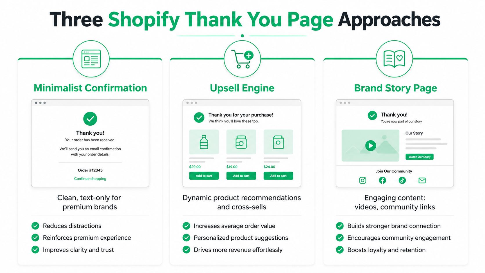
Minimalist confirmation
This version keeps the page extremely restrained. It's a good fit for luxury, design-led, or premium-positioned stores that want the post-purchase experience to feel calm and polished. The trade-off is that you gain elegance, but you leave less room for upsell or operations work.
Upsell-heavy page
This layout suits stores that already know their offer stack and want to make the most of the post-purchase moment. It can work well for catalog-driven brands where related products are natural add-ons, but it can also get noisy if the offer logic is weak. If the customer feels pushed too hard right after paying, the page can damage trust even while it lifts short-term revenue.
For merchants thinking about how this connects to broader retention flows, the same tension shows up in Shopify SMS abandoned cart recovery, where timing and relevance decide whether a message feels helpful or intrusive.
Operations-driven page
This is the version most guides ignore. It treats the thank you page as a post-purchase control panel, with self-service edits, order guidance, and support routing built into the experience. That profile fits Shopify Plus and other high-volume operators that need fewer tickets, cleaner orders, and a better handoff between checkout and fulfillment.
The upside is obvious. You can deflect easy support requests before they become tickets, and you can guide customers toward a useful next step without relying on human intervention. The trade-off is implementation discipline, because operations logic can clutter the page if it isn't limited to the most common, highest-value actions.
Measuring Success and Running Your First A/B Tests
A thank you page shouldn't be launched once and forgotten. The first question is simple, does the page improve the behavior you chose to optimize? The second question is just as important, does it preserve trust and page speed while doing it?
Start with one test variable
Test the headline, the primary CTA, or the placement of the upsell module first. Don't test all three at once. If you change everything together, you won't know whether the lift came from clearer confirmation, better offer placement, or a stronger call to action.
Use Shopify analytics alongside your post-purchase app reporting so you can separate clicks from real outcomes. A click on an upsell is not the same as a completed added-to-order event. Likewise, a support link click is not the same as a ticket deflection unless the shopper resolves the issue without opening a case.
Read the right signals early
The first read should focus on order flow integrity, click behavior, and whether the page slows down after changes. If your page builder or widget changes the experience enough to affect performance, validate that it hasn't harmed the post-checkout handoff. For a broader implementation lens, conversion rate improvement tactics can help frame the test plan without overcomplicating it.
A practical first wave of tests usually includes:
- Headline clarity: Does a more direct confirmation reduce confusion?
- CTA wording: Does one action outperform another in post-purchase context?
- Upsell placement: Does the offer work better lower on the page or immediately after confirmation?
- Support link prominence: Does making help easier to find reduce friction without stealing attention?
Keep the early analysis focused on clean signals, not vanity clicks. If the page gets more taps but fewer completed actions, the test did not help.
A 14-Day Launch Checklist and Common Pitfalls
A good launch doesn't start with design, it starts with the current state of the page. First, review what the existing template does well, then define the KPI you care about, then decide which action deserves the primary spot. After that, build the page in preview, check the mobile experience, and soft-launch before you treat the new version as final.
A simple rollout path
Days one to three should be audit and definition. Days four to seven should be draft, layout, and content. Days eight to ten should be QA across mobile devices, order types, and languages that matter to your store. Days eleven to fourteen should be soft launch, review, and adjustment.
The common mistakes are predictable. Teams overload the page with CTAs, skip mobile testing, ignore accessibility, or treat the page like marketing only and forget that it also has an operations job. That's where most friction starts.
If the customer just paid, your first responsibility is clarity. Revenue opportunities come after that, not before it.
The best thank you page design respects the moment. It reassures the buyer, reduces support work, and opens a useful next step without crowding the screen. If you're ready to turn that quiet post-purchase moment into a cleaner workflow and a stronger conversion surface, A CTA for SelfServe.